SQUIRCLE TYPEFACE
The brief explores symbiosis through the symbolic relationship between a square and a circle, leading to the creation of a unique typeface called Squircle, blending perfection and harmony.
DESIGN CHALLENGE
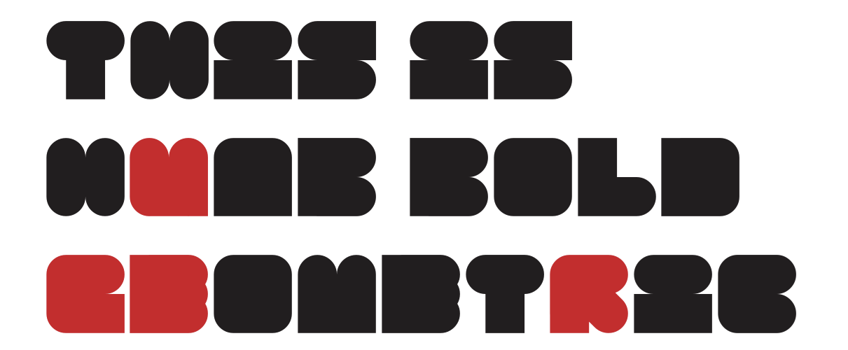
While searching for similar fonts, I found Huab Bold Geometric Font, which uses squares as the main frame and circles as details. However, identical character dimensions and subtle cuts in letters like E, F, G, Y, R, and U made them hard to read, compounded by inconsistent negative space. I plan to start with a square frame but will enhance readability by balancing the contrast between squares and circles.
DESIGN APPROACH
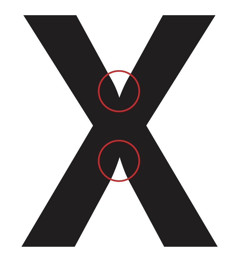
Inspired by Futura and Helvetica, I explored symbiosis in typeface design. Futura's "X" revealed an optical illusion—a pointed gap that subtly curves—showcasing how typography favors legibility over perfection. I applied these principles to adjust letter shapes for readability and visual harmony. Using a 6x6 grid to represent human perception, I linked squares and circles to reflect interconnected ideas. Inspired by Futura’s precision, I maintained consistent x-height and kerning while prioritizing visual balance, especially in letters like "G." This approach blends systematic design with creativity, resulting in a typeface that balances aesthetics and legibility.
TYPE CONSTRUCTION
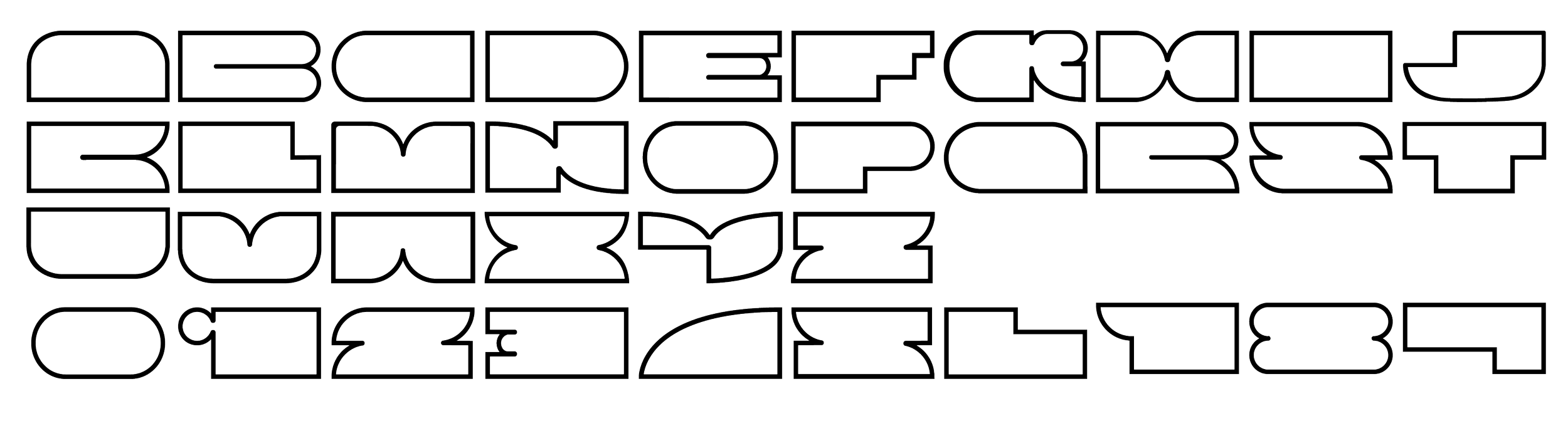
The typeface is built using a 6x6 square grid and four shapes. To enhance creativity, I developed a stroke version and an extended version, both crafted for visual harmony. By rounding joints and slightly deviating from the grid, like applying the overhang principle to the letter "G" and adjusting the visual direction of "N," I achieved a balanced, reader-friendly design.
Typeface
Squircle
Designed by
Louis Nguyen


DESIGN REFINEMENTS & VARIATONS
DESIGN REFINEMENTS & VARIATONS
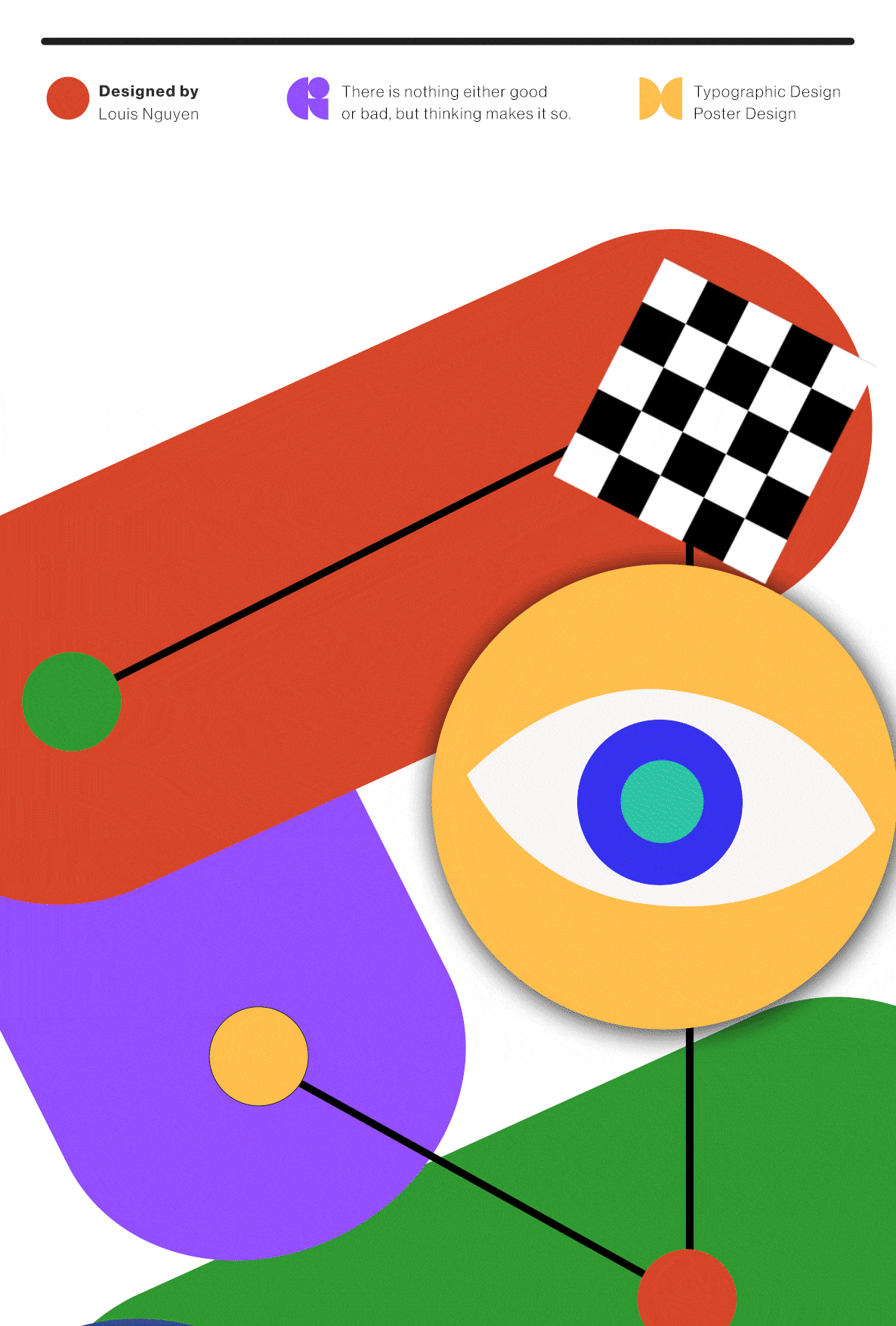
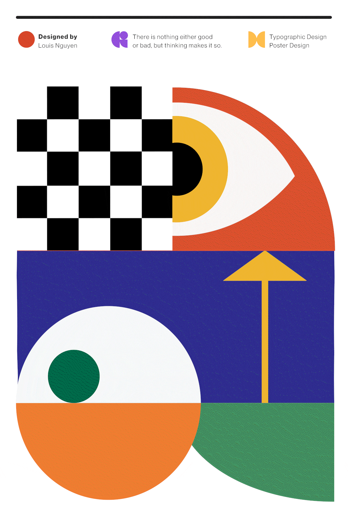
APPLIED TO POSTER SERIES


Refinement

Construction
Expansion
REFERENCES
Visual Balance & Typography References
Lupton, E. (2006). Visual balance in design. Princeton Architectural Press.
Lupton, E. (2004). Thinking with type. Princeton Architectural Press.
Dabner, D. (2013). Graphic design school: A foundation course. Laurence King Publishing. Font Design & Engineering References
(Spiekermann, E. (2012). Stop stealing sheep & find out how type works. Laurence King Publishing. Bringhurst, R. (2004). The elements of typographic style.
Hartley and Marks Publishers. Felici, J. (2010). Font technology. Media Alliance.
Case Study References
Lars Müller Publishers. (2007). Helvetica: Homage to a typeface. Shaw, P. (2000). Futura: The typeface. Butterworth-Heinemann