HELVETICA NOW ZINE
This zine explores Helvetica Now, a refreshed typeface designed for the digital age, highlighting its evolution, improved readability, and its significance in modern design trends.


IDEAS
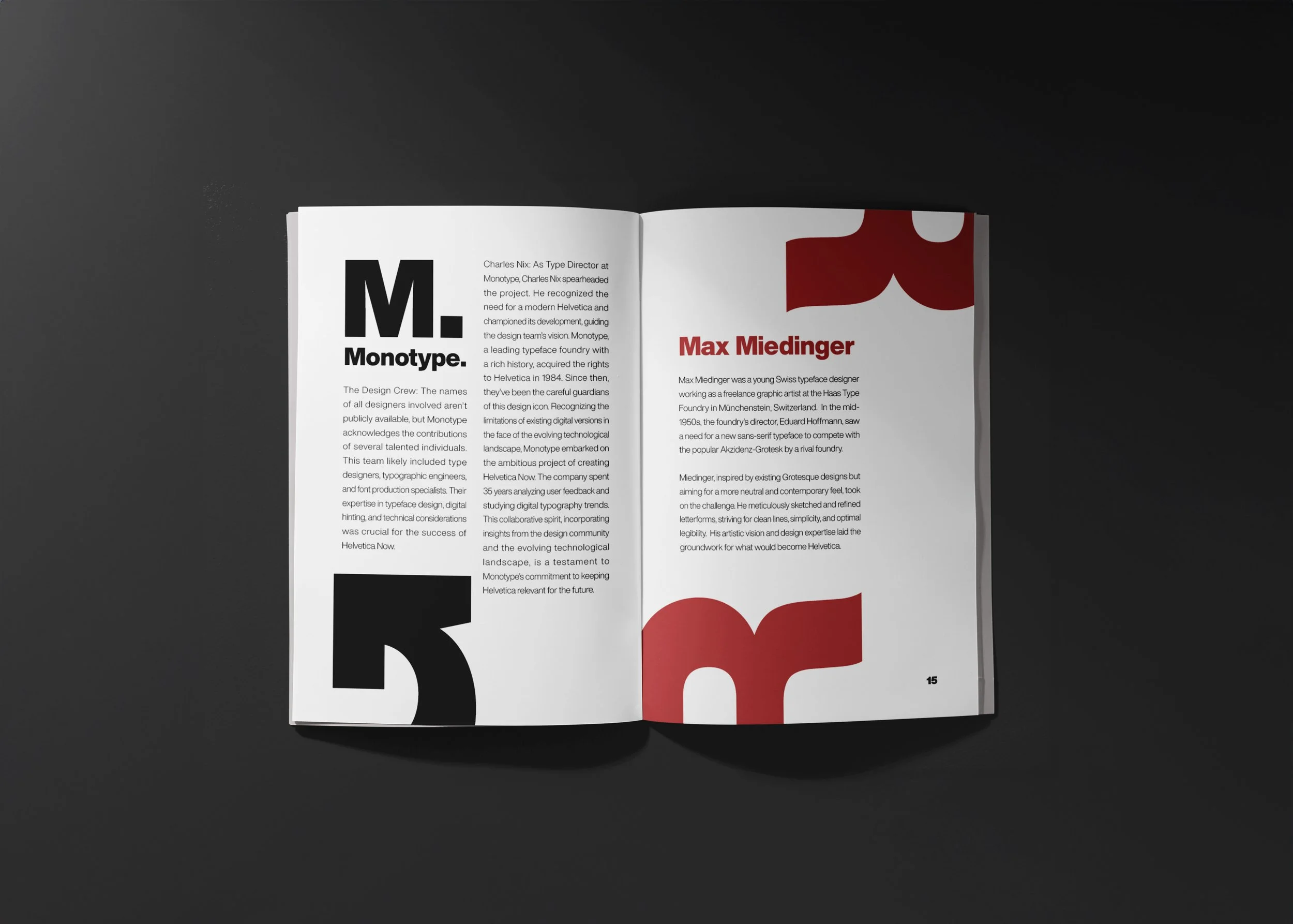
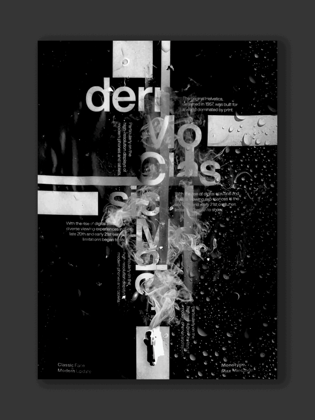
I explore how Helvetica struggled in the digital age and how this new iteration tackles those limitations. Imagine a world dominated by print, where Helvetica reigned supreme. Fast forward, and digital screens expose the need for a change. Helvetica Now isn't just a single font; it's a family (Micro, Text, Display) designed for various digital applications. Subtle adjustments like a more open "e" enhance readability. But the secret weapon lies in "hinting," instructions for devices to render the font flawlessly across sizes. This zine is a tribute to Helvetica's legacy and a celebration of how design adapts and innovates in the digital age.


DESIGN PROCESS
Explore creative ways to showcase Helvetica Now. Use different sizes, orientations, or even slightly distorted variations for a dynamic effect on the cover or throughout the zine. Consider using red sparingly as a background color for pull quotes or captions to create a layered look, ensuring the text remains readable. Strategically use whitespace to create a visually balanced and breathable layout. This allows elements to stand out and prevents information overload.
INSIGHTS
The project also became a lesson in design storytelling. The limitations of including fonts directly pushed me to get creative, using clear descriptions and references to paint a picture of this modern typeface. It was a reminder that collaboration fuels creativity, with information from the design community playing a vital role. This zine was more than a project; it ignited a deeper appreciation for the details that breathe life into a typeface. The challenges became stepping stones, fueling a desire to explore more design stories through the lens of a zine.

Design
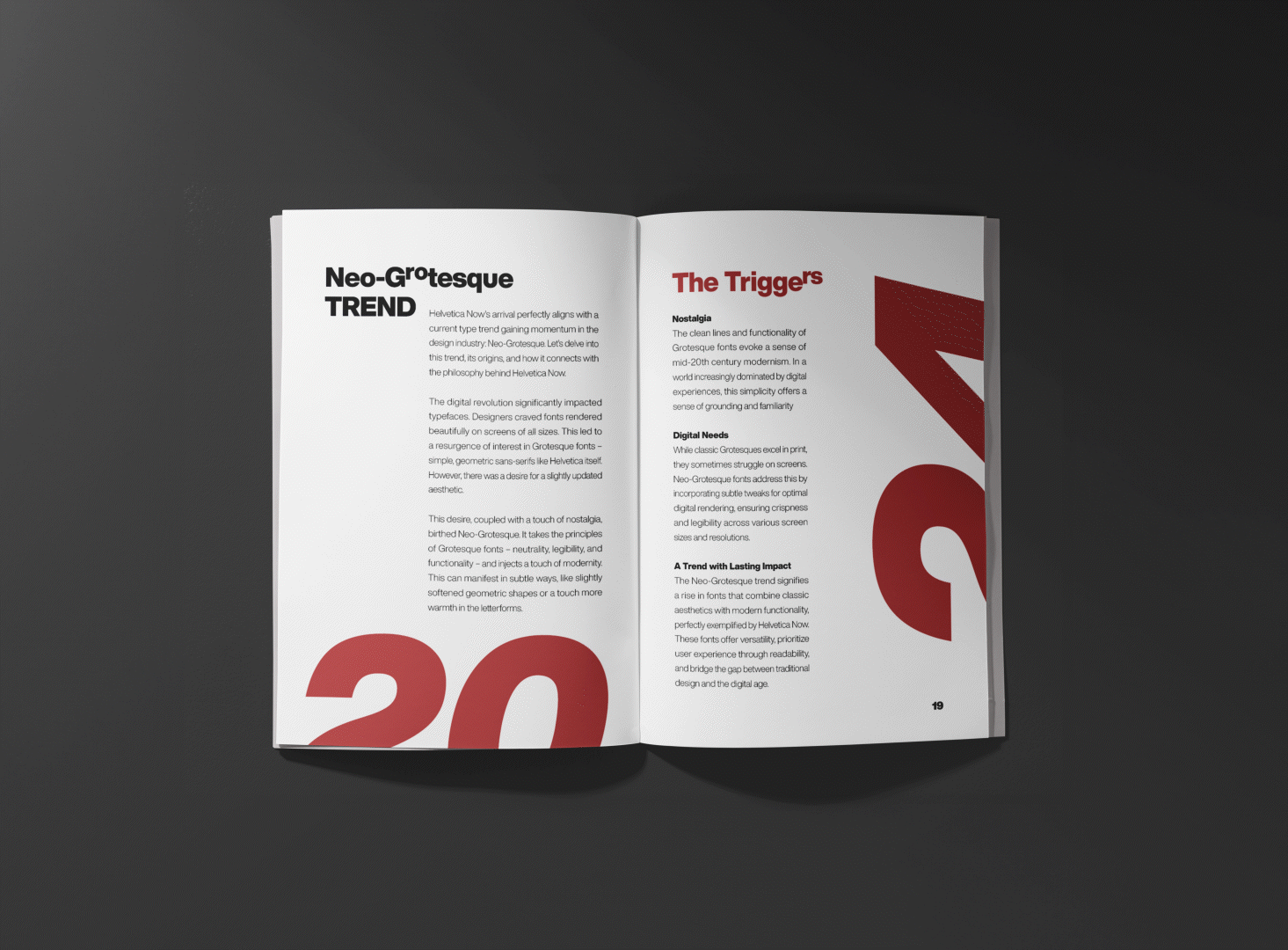
This zine goes beyond technical details, celebrating the design evolution with connections to the Neo-Grotesque trend. It acknowledges the challenges of describing fonts without visuals, but also the triumphs of unveiling technical details in a creative way.