Develop a brand identity for record label which is one of the key brand in an entertainment corporation for its next national campaign This entertainment corporation is producing cutting edge content and products for youth oriented market
My strategy
I think a good song is not created by good melodies but created by a combination of many other things such as artists, audiences or even every single note in the song. Although this brand is producing cutting edge content and products for youth-orientated market, which needs to be a lot of energy. I want to give the identity for this brand not energetic, hi-tech but also humble and timeless
Research
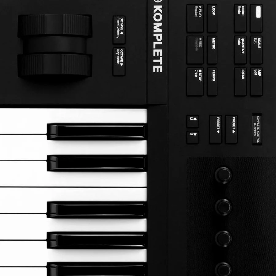
In the 1960s, music was recorded live with analog mixers, like those at Raymond Scott’s and EMS Putney Studios, known for their advanced tech. Today, studios like Eastwest use modern technologies, but analog mixers are still valued for their warmth and depth. Sound signals, absorbing panels, and compressors, key in cutting-edge production, inspired this project’s design choices.

Image Source: Google Images
Name iterations
Tech Tune
SpundZ Music
Futurize Music -Fusic
Techno Trends
Digital Vibe -DVbe
Record Teen
Record Z -RecZ
Next Gen Music
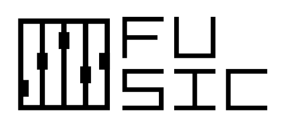
Fusic
Pushing the boundaries with tech

Image Source: Google Images
Logo Iterations

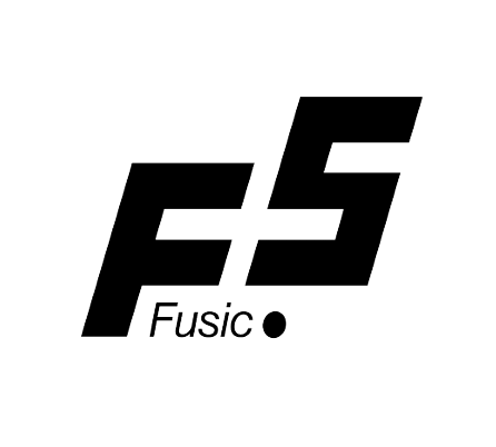
Of the 9 logos, this one best represents the brand. The white space between the F and S forms a plus sign, symbolizing Fusic's high quality and positive impact. The S resembles a 5, suggesting "F5" for refreshing, indicating Fusic's trendsetting nature. The italicized F and S add energy, aligning with the brand's target market.
I think I can do it better
Why don’t we start at the origin of the music-producing industry. And then combine with modern technology to approach a youth-oriented market?

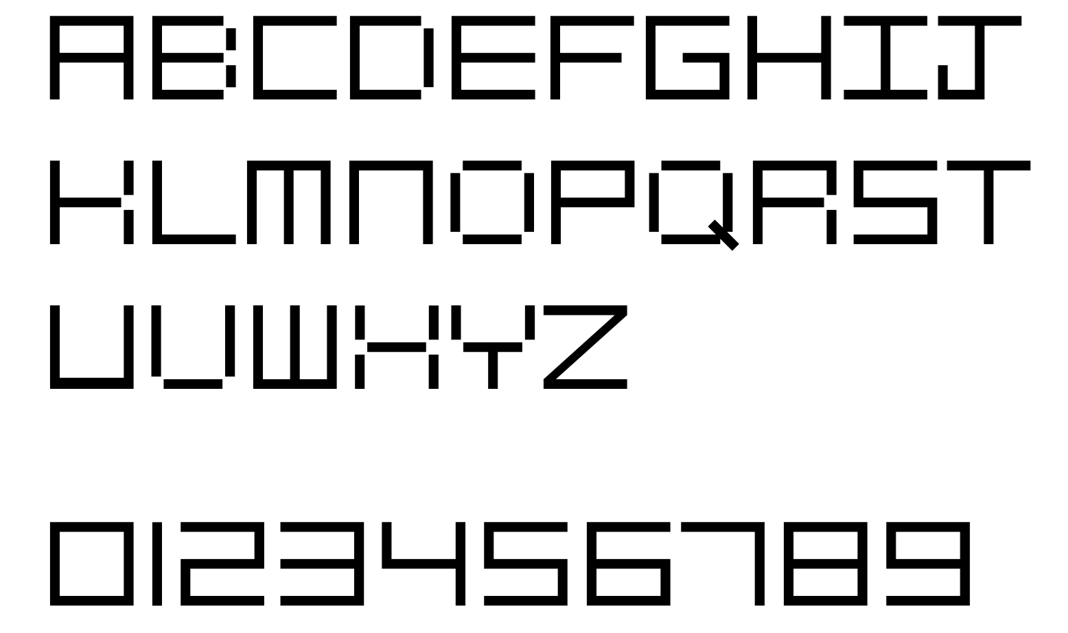
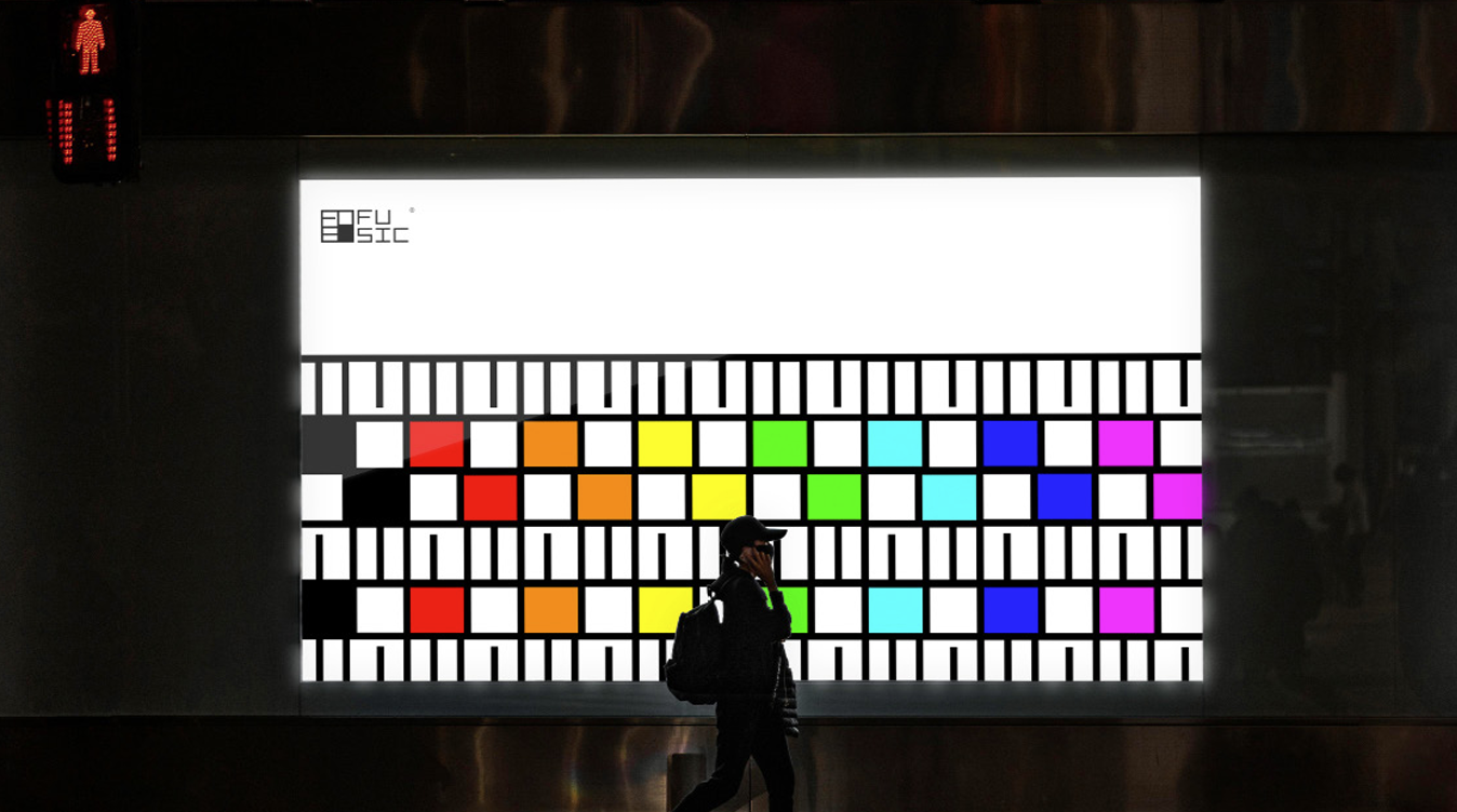
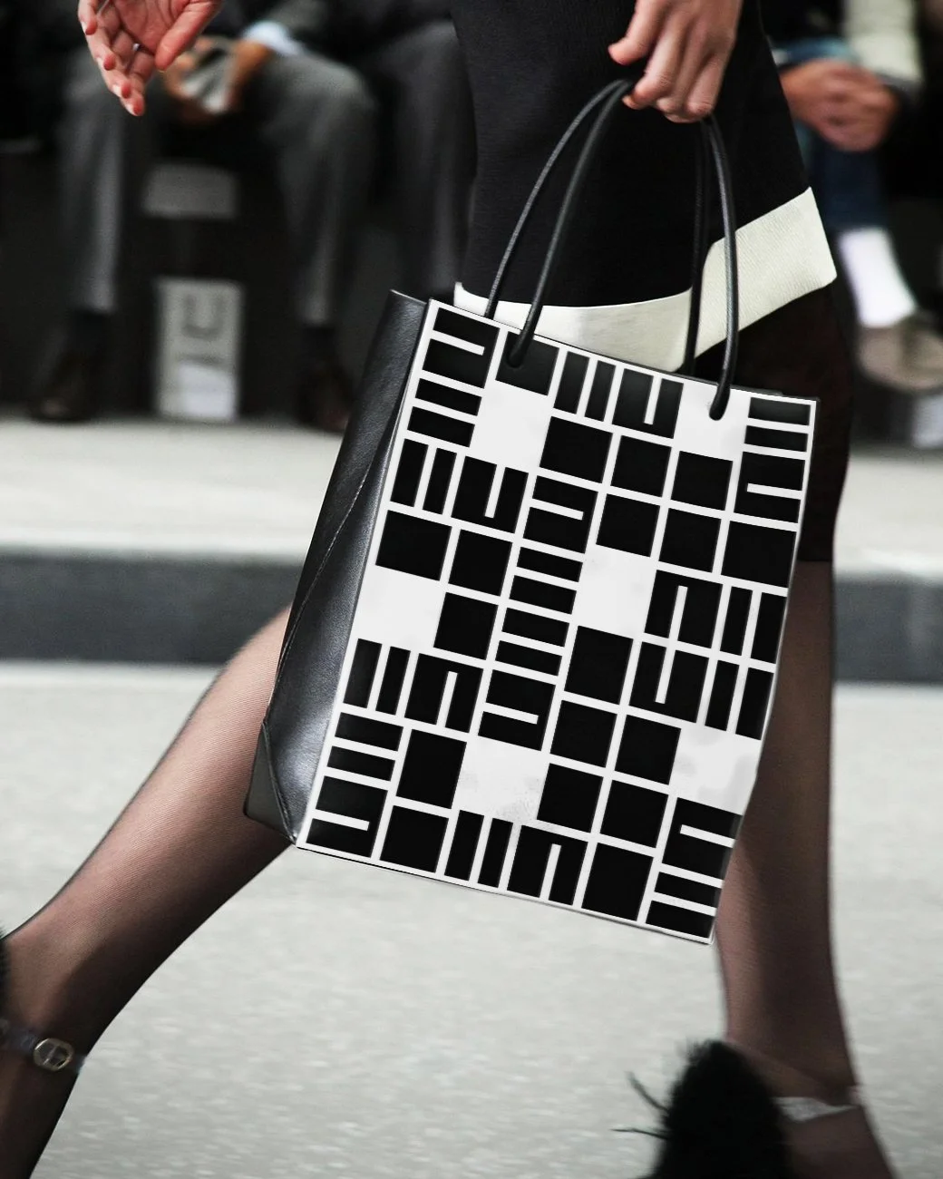
FUSIC TYPEFACE
Better?
If each of the letters is formed by a square which means it can also be a unit of a bigger square? And this design language stays true to my initial approach which is the music is not just about the melody but is a combination of many other things
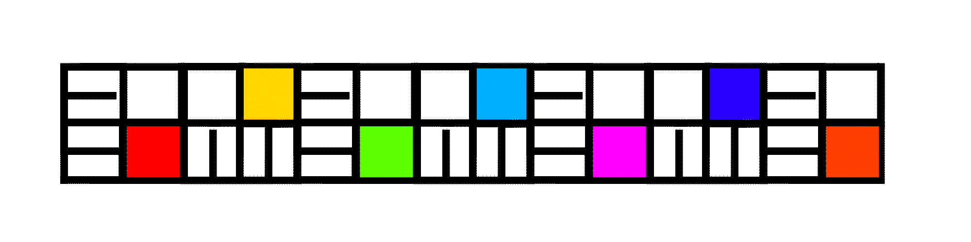
Composing Team
Producing Team

Recording Team
Hint

As the logo is square, it works best in the corner of the layout, while the 45 degree rotation version can be used in the middle